Nova United is a company whose mission is to unite the world through block chain technologies. The logo signifies the block and can be viewed as a cube but also the uniting of the letters on the block help reinforce the company’s mission of uniting people.
logos
coLors
etc.
Overview
Project
NovaCore System design
Roles
Art Director
CMO
Teammates
Marketing Manager
Graphic Designer
Tools
Adobe Illustrator
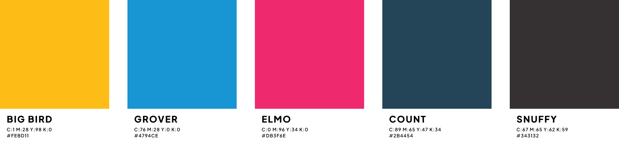
The colors
Logo
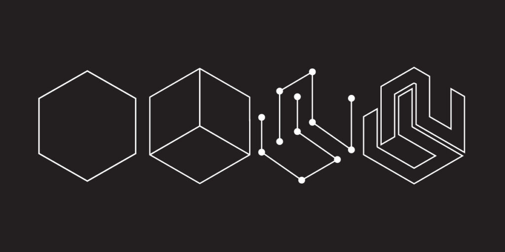
The logo features a three-dimensional cube as its primary shape. The cube is a solid, stable form, suggesting reliability and strength. Its three-dimensional nature adds depth and complexity to the design, which is appropriate for representing blockchain technology.
Within the cube, the letters “N” and “U” are skillfully interlocked. The “N” and “U” represent “Nova” and “United,” respectively. The interlocking design symbolizes the fusion of the new with unity within the blockchain technology.
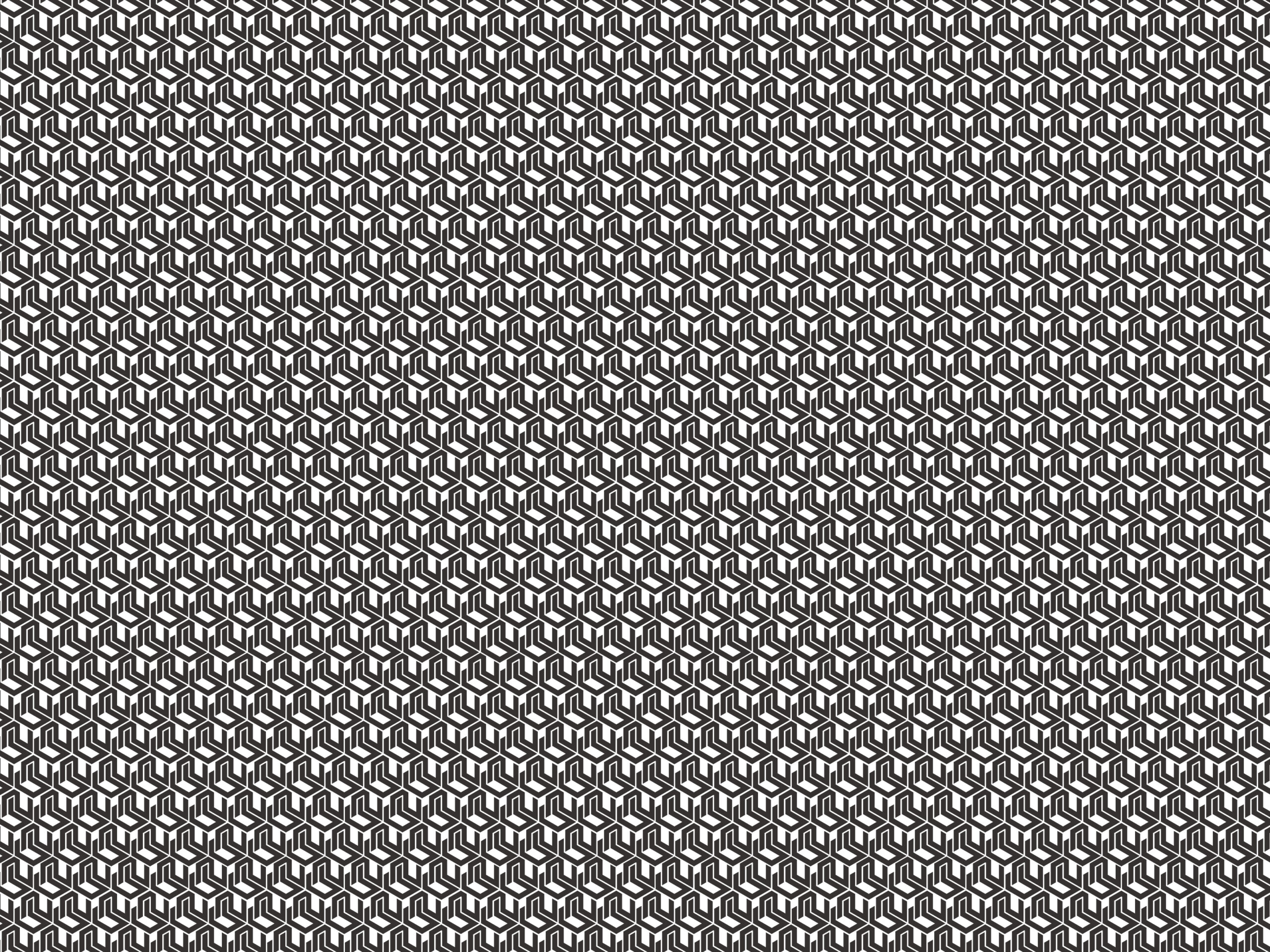
The design is versatile and can be adapted for various applications, such as digital platforms, business cards, and promotional materials. Its three-dimensional nature adds depth and makes it visually engaging.
Usage
1. Logo Variations:
- The logo is designed with variations for different contexts, including full-color, monochrome, and grayscale versions.
- Full-color is recommended for digital and print use, while monochrome or grayscale versions may be employed when necessary for contrast and legibility.
2. Minimum Size and Clear Space:
- The logo should not be used below a minimum size of 1.5 inches in width to ensure clarity and legibility.
- Maintain a clear space around the logo equal to its height to prevent visual clutter and preserve its three-dimensional appearance.
3. Color Specifications:
- The logo primarily features a gradient blue color for the cube with subtle metallic accents on the interlocked “N” and “U.”
- The specific color values are provided, including the gradient blue’s PMS, CMYK, RGB, and hex color codes, ensuring consistent color reproduction.
4. Proportions and Scaling:
- When resizing the logo, maintain the original proportions to safeguard the cube’s three-dimensional appearance and visual impact.
5. Incorrect Usages:
- Avoid common mistakes, such as distorting the cube’s proportions, altering colors, or introducing unapproved variations.
6. Background Usage:
- On various backgrounds, ensure the logo remains visible and harmonious by following clear guidelines for contrast and adaptability.
7. Clearing Space:
- Maintain the designated clear space around the logo to prevent visual interference and maintain its distinct presence.
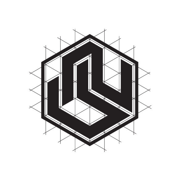
Logo Grid
The logo was designed on a grid based on a hexagon to give it a geometric and balanced appearance. A grid based on hexagons can create a visually appealing design
Logo Shape: The logo consists of an interlocked N and a U shape that forms the core of the design. The grid gives an appearance of a block but remains on the grid creating a sense of stability and balance.
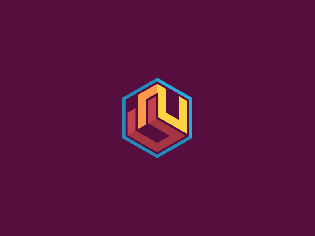
Alternate Color Scheme
The alternate color scheme embraces a harmonious blend of different shades to evoke depth within the cube. Utilizing a rich, warm pallette it will create the illusion of depth, enhancing the three-dimensional nature of the design. The interlocked letters “N” and “U” within the are accentuated with subtle red and yellow elements allowing the cube to stand out with its blue backdrop. This combination of colors evokes a sense of depth and complexity.